


13Dec
How to understand data and make infographics design?

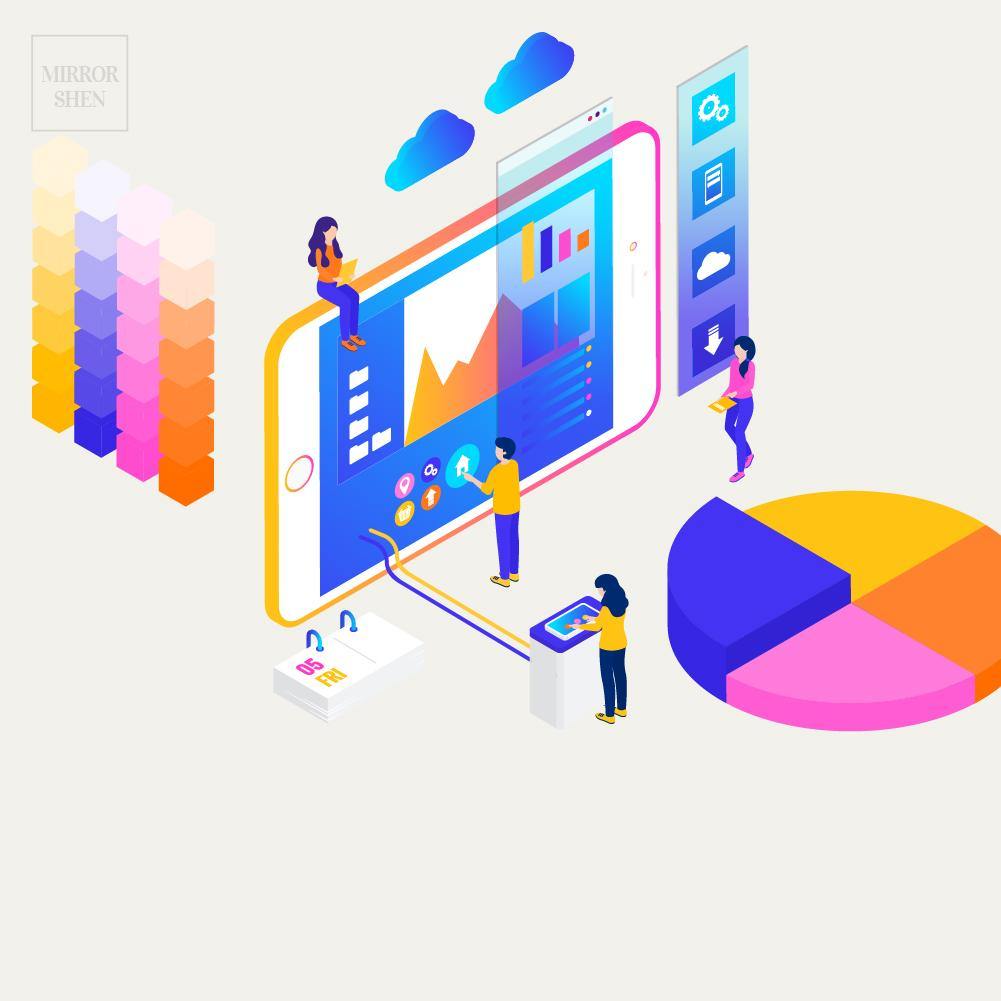
Infographics design is very useful for presentation. The concept is like User Interface (UI) Design. The goal is to make users clearly understand your messages on one page.
💡 Data Cycle & Insights
👉 The 4 main stages of a data cycle
- Plan - Start by identifying the goals of the presentation.
- Run - Then, give it a run and begin collecting the relevant data.
- Check - Once you have the data, review them.
- Test - Lastly, take action to test the hypothesis.
👉 6 steps to uncover your own actionable insights
- Define your goal: Clearly outline what your presentation aims to achieve.
- Collect the data: Gather and organise any statistics or information relevant to your goal.
- Interpret the data: Analyse trends and any deviations from those trends to see how this has affected meeting your goals.
- Develop recommendations: Provide justified suggestions on how to improve business practices based on what you have learned from your data analysis.
- Take action: Put your recommendations into practice and create an action plan to test your assumptions.
- Review your outcomes: Evaluate whether your actions have had the desired impact and make note of how you can further optimise to improve results.
💡 Visual Formats for Data Presentation
Here are some popular visual formats:
👉 Tables
Tables can be used to display smaller data sets, allowing for comparisons to be made quickly.
👉 Pie Charts
Pie charts are useful to display percentages or proportional information in an easy-to-digest way.
👉 Bar Charts
Bar charts are great for comparing related items in a group, where the length of each bar is proportionate to the value it represents.
👉 Line Graphs
Line graphs are useful for understanding how data changes over time, for example, whether your website traffic has increased over the past month.
👉 Heat Maps
Heat maps are often used to represent performance by area, such as which parts of your website people are clicking on most.
Reference:
Google digital garage