
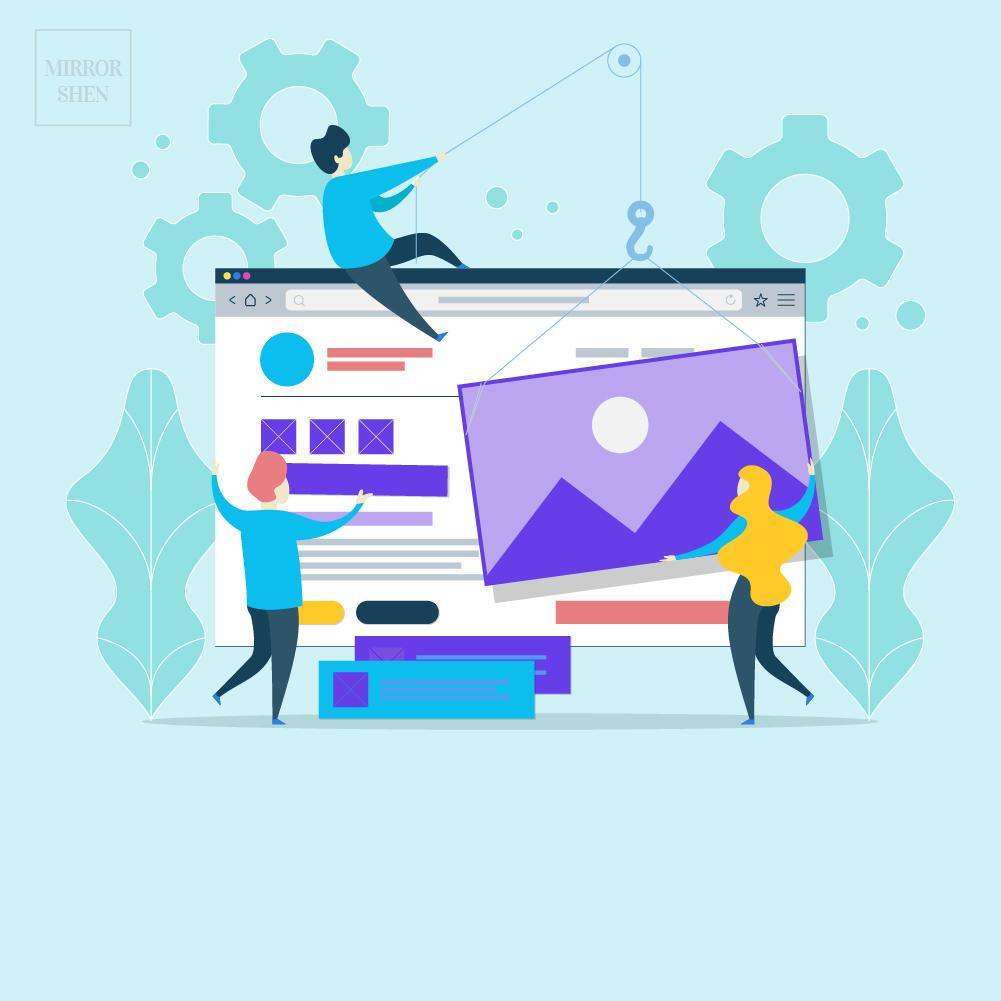
How to make my website look good?

We have talked about how to make a website and sell online. Now this is another topic. Even though we call it website design, web design is totally different from graphic design. It’s not just placing graphic elements around and making it look good. It’s more about how to deliver messages through the way that makes sense.
💡 3 values to make a good website design
A good website design doesn't mean good-looking.
The value is to be Effective.


👉 LOOK: Make it professional
What to consider:
- Logo
- Brand Colour
- Domain
- Business Email
- Font Family, Size & Colour
- Images
- Matching Brand Colour Scheme
- Consistent Visual Style
- Implying the End Result
- Supporting Message Properly
- Contrast between each Section
- White Space
- Harmony
🤓 Keep in Mind
Logo is not that important for website design.
The whole look and feel are the key to website success.
Don’t struggle too long if you don’t have a satisfying logo yet.
Even a text placeholder is fine. You can always improve later.

Photo from google search
Always keep consistent visual style.
It will help harmony of the design and make it professional.

Photo from google search

Photo from google search
Use image that can support message properly
Instead of telling people who you are and what you have,
tell them what they can get and how you can offer them.

Photo from google search
😉 Inspirations: Brand Colour Scheme
Feel free to check my pinterest boards and get some ideas.
https://www.pinterest.nz/mirrorshen/

🚩 TIPS: Google Fonts
Google fonts are free fonts and compatible with most website systems, browsers and devices. Choosing google fonts and passing them on to your designers and developers will help the process easier.

👉 FEEL: Deliver clear message
- Navigation menu display.
- Homepage hero photo to support USP (Unique Selling Point).
- User Interface for easy reading flow.
- CTA (Call To Action) button.
- Copywriting
- No | Super Creative
- No | Fancy Words
- Yes | Keep it Simple and Direct
- Yes | Follow Customer Behaviour: Attention > Interest > Desire > Action > Share
- Yes | Understand Humanity: Avoiding Pain and Chasing Happiness

😉 Inspirations: Navigation menu
Navigation menu is one of the most important parts of the design. Without an easy-to-use menu that seamlessly leads visitors to browse through your website, people will struggle to find the information they want. Once they get frustrated, that’s all it takes to make them leave.
Planning navigation is very crucial. Here are a few examples to show different ways to present your website structure and product categories.


😉 Inspirations: Mega Menus
Mega menus are a type of expandable menu in which many choices are displayed in a 2D dropdown layout. They are an excellent design choice for accommodating a large number of options or for revealing lower-level site pages at a glance.


🤓 Keep in Mind
5 Seconds Rule:
If you cannot make website visitors get a message about who you are and what you do in 5 seconds, most likely they will close the tab and jump to other websites they opened to browse as options. So spend time to do research regarding how to get your USP right.

🚩 TIPS: Trigger of Attention
- CURIOSITY:
- Number: 3 Ways to run Free Marketing online.
- Question: How to hack a money Machine?
- Unusual Naming: Grandpa Sales Method got me 37% Business Growth.
- BENEFIT:
- Learn Tarot VS Predict your Future and make the Best Decision.
- Diet Recipes VS 30 Super-Easy Dinners That'll Help You Lose Weight.
- Buy Insurance VS Build Security for your family.
- Sick of the Dog Hair at home? Try our Powerful Vacuum Cleaner!
- Never met the right girl? Find LOVE on our Premium Dating Network!

👉 INTERACTION: Usability experience
The biggest advantage of a website is to interact with visitors and convert into conversions. To make the best experience requires user experience design and marketing strategy. It’s all about keeping testing and refining. Here we will just talk about some simple steps to start with. You might need web developers to help if it’s involved customisation that doesn't come with the original system.
-
First, Set Goal for Marketing Strategy
Prize Draw Competitions, Links from How-to Articles, Limited-time Promotion, etc. -
Define Call to Actions for Conversions
Sign Up Now, Contact us, Book now, Buy now, Get your Free xxx, etc. -
Plan a draft and Design a Mockup
Get the flow and look right before going to development. -
Build, Test, Launch, Review, and Refine.
It’s an ongoing process. Also remember to get optimised on all Devices

😉 Ready to give it a try with your ideas?
Try Shopify for Free